It's ringing…
“ Hello, this is Mr. X from the Canada Revenue Agency, how can I help you?
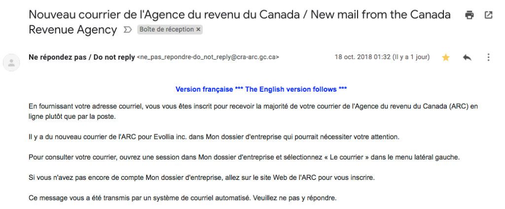
– Hello, I received an email notification that I had mail in My CRA Business Account , but when I log in and go to my “Message Center”, my last communication was from 2015…
– We’ll take a look at this ma’am. Are you currently connected to your business account?
– Yes.
– Can you read me the content of the email sent to you? “. I then read the outline to him.

Mr. ARC: “ So you have to go to your mail.
– That’s what I do, but it’s nothing recent. “.
Mr. ARC who repeats: “ You must go to your mail.
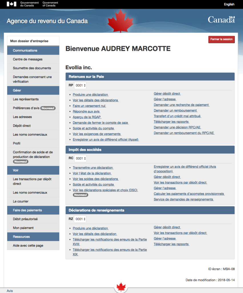
– I’m in my messages. “. I then list the tabs on the left.

Mr. CRA: “ Go to the bottom of the screen, you will find the tab “Mail”. “.
I’m stunned: ” You did THAT??
– …?
– You have separated the “ Message center ” and “ Mail ”? I must not be the first person to be confused, sir.
– …?
– Listen, I work in the field of user experience and what I see there is a blatant lack of user-friendliness. (Forgive my “I’m working in this.”, but I only take it out when I’m really “ flabergasted”.)
First, we agree that “mail”, semantically, is similar to a “ message “…

Then, I receive a monthly invitation to log in to check my mail, even though the “Mail” tab is not even inside the screen page. It’s probably one of the most viewed tabs and it’s hidden at the bottom of the screen. But the “Message Center”, meanwhile, is at the top of the screen. It’s inconsistent.
Finally, I signed up for email correspondence a few weeks ago, and since then the CRA has been sending me MORE correspondence than when I received it in paper format. Why? I have never subscribed to anything else and, to my knowledge, I cannot change the types of correspondence I wish to receive. As a result, I am condemned to receive a monthly email that I will not consult, because it is an opinion of no importance in my case. »
There followed a brief exchange with Mr. ARC who unfortunately did not have enough arguments to defend his point.
In a nutshell
There are some principles of user experience (UX) that don’t seem to be respected:
- Clarity and consistency of navigation: the “Mail” tab should be easily accessible if it’s one of the most consulted elements, and its position at the bottom of the screen creates inconsistency with the “Message Center” at the top of the screen. The user interface should be organized to offer intuitive navigation.
- Transparent communication: The user receives an invitation to consult his mail, but the location of this tab is not clearly indicated within the communication. Transparent communication should have explicitly indicated where to find “Le courrier” to avoid any confusion.
- Preference customization: Users cannot modify the types of correspondence they wish to receive. The lack of control over communication preferences runs counter to the principle of offering a personalized user experience.
- Understanding needs: The user receives irrelevant e-mails. This suggests a lack of understanding of the user’s needs.
In short, improved clarity of navigation, transparent communication, personalization of preferences and understanding of user needs would all contribute to a better user experience in this context.
In conclusion
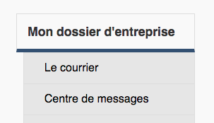
Since my tirade, I have noticed that the CRA has moved the “Mail” tab so that it appears at least on the screen. Coincidence? Perhaps.

One thing is certain, I believe that the CRA would benefit from getting to know its business clientele better and carrying out user tests of the current interface of its client space in order to optimize it. For the time being, the “My ARC company file” interface doesn’t fit in with users’ mental models.
I ask you: Has this situation ever happened to you or have you ever received feedback like this within your organization?

Leave a Reply