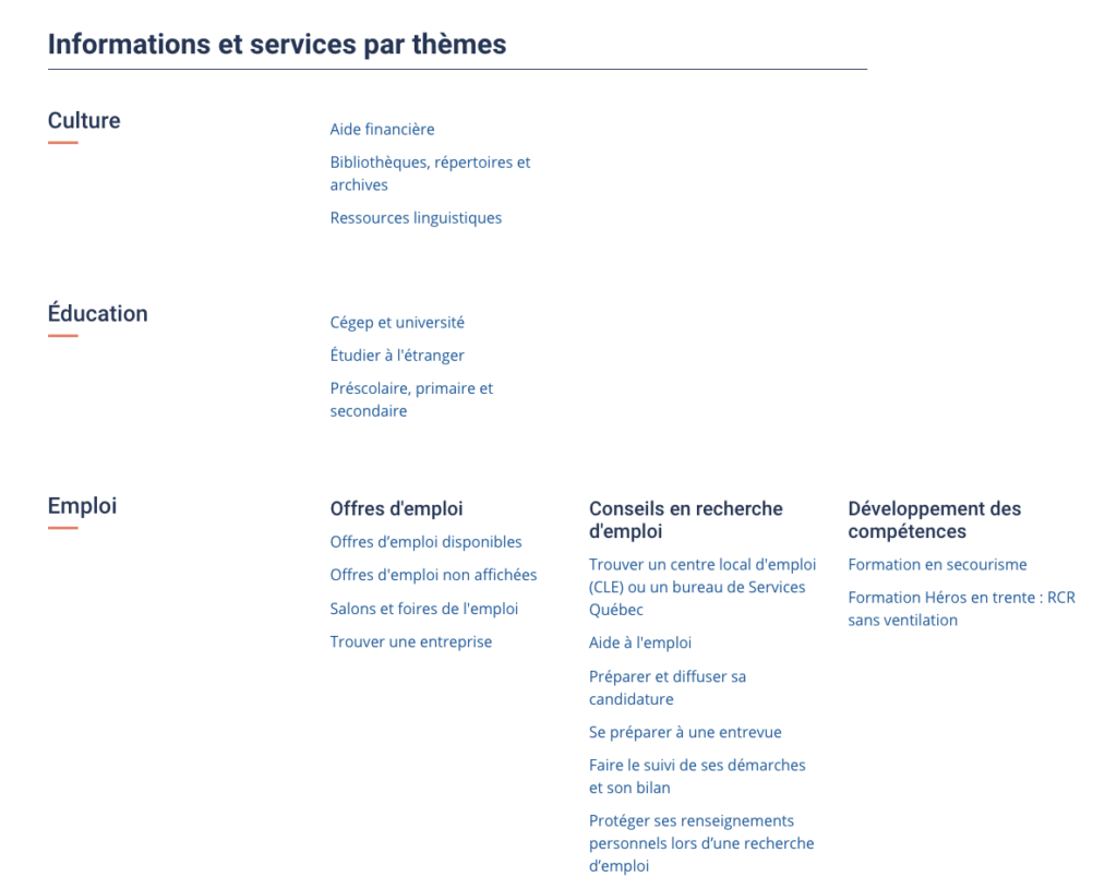
Have you heard of Québec.ca ? This is the new Quebec government site that was launched less than a year ago. The initiative draws on good “citizen-centered” design practices and other “centralized” government sites, such as Canada.ca , Gov.uk , Ontario.ca , etc. The ultimate objective of such a platform is to bring together government content (currently scattered over some 800 sites) so that everyone can find themselves under the big hat of Québec.ca . Large-scale work, that goes without saying.
As part of a mandate, I had the chance to familiarize myself with Québec.ca , in order to design a conceptual content architecture that would be integrated into the platform. Thus, I have browsed (a lot) on Québec.ca , but also on other similar government sites. It is by exploring and comparing that I was able to list several good hits from our Quebec.ca , both in terms of user experience (UX) and Search Engine Optimization (SEO) . I present them to you here.
It has a search tool.
Is that obvious, do you think? Instead, take a look at the Australian government site at Australia.gov.au and see for yourself: no search box. We can thank the Quebec.ca team for not having neglected this aspect of the site. As for search performance and relevance, I haven’t personally tested and proven them, but I’ll tell you about that in a future post, okay?

It has a breadcrumb .
What was my surprise to discover that Ontario.ca did not have a breadcrumb trail. Fortunately, Québec.ca has one, which remains an important visual cue for citizens, but also a good SEO practice.

It has semantically relevant URLs.
This point is linked to the previous point: On Québec.ca , the more you advance in your navigation, the more the URL is constructed semantically in a logical way. So, even if your subject is in the fourth basement (favorite expression of a former teacher), the URL remains relevant.
This is not the case with other sites, such as Ontario.ca , which only use the page title as a URL. We can guess the beneficial aspect behind this choice: if content is moved to another section, there is no need to do a 301 redirect. On the other hand, in terms of SEO, this is a glaring lack.


It has a site map.
Here too, at the search engine optimization level, having a sitemap is not optional. In addition, for a large site, it is polite to offer this search mode to your visitors. And not all government sites have one, unlike Québec.ca .

It does not have a splash screen .
First of all, know that I never thought I had to write the words “ splash screen ” in an article. At least not in 2018. Our neighbors in Ontario have found it appropriate to use this (old) technique to force citizens to choose their language of consultation if they use the Ontario.ca home page. Knowing that today, it is possible to recognize the language of the visitor’s browser and display its content in its own language, a “ splash screen ” does not appear to me to be relevant at all. Enlighten me if you can.

Quebec.ca instead uses a language selector, a more modern feature.

It uses a principle of anchors .
When a page has a certain length, Québec.ca uses an anchor principle, by presenting the main sections of the page in list form, with links to these sections. The user thus avoids scrolling the page and can click to directly access its content.

In conclusion
This is a non-exhaustive list of some good practices of the new Québec.ca site, when compared to other similar sites. It could also lengthen, I invite you to write to me or leave a comment if you want to participate in the discussion. Looking forward to reading you!
PS Notice to the Ontario.ca team: there is still a long way to go. Please note that I can help you;).

Leave a Reply