The world and times are changing. The web too.
On the other hand, the web does not always evolve at the same rate as the users of the sites, who are becoming more and more familiar with certain principles and functionalities. Before, we wrote everything: Click here , Back to home , Read more , etc. Over time, a much simpler and much more visual implicit web code took hold . I wouldn’t dare to say that this code is fully acquired by 100% of users, but it is on the way to becoming so. This article aims to list elements from this code, in order to continue this momentum and simplify our interfaces. I also invite you to read this excellent article which deals with the progressive simplification of UI .
Logo that directs to the reception
It is obvious. The logo directs to the homepage. So why do we still see “Home” labels inside a menu?

* Required fields
It’s a known formula: we stick an asterisk to a mandatory field. The mention the reference
“*Required fields” is still very present, but does it still need to be? The asterisk alone could definitely do the job.
Read more
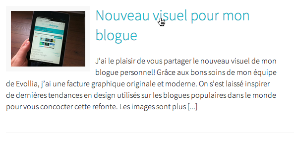
Blog posts are often presented with an excerpt that ends with the traditional “Read more> “. Knowing that the title of the article is clickable (as is the image if applicable), do we still need this link? I allow myself to doubt it.
The “Enter” key that replaces buttons
Two simple examples where pressing “Enter” replaces the presence of buttons. Good principle to consider depending on the context.
The “search” button
A search field is often accompanied by a button to submit your request: a magnifying glass or the “Search” button. Ideally, this same request can be activated simply by pressing the “Enter” key. So, do we really need the button?
“Comment” button
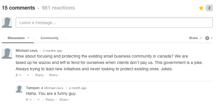
Comments to Facebook or Disqus use the “Enter” key to send the written comment. This principle is increasingly accepted by users, so we can afford to question the presence of the “Comment” button.

Home on Ariadne’s thread
A larger site requires a breadcrumb trail. This one is good for SEO and gives the user a visual cue of where they are on the site. An increasingly accepted code is the replacement of the term “Home” by its icon, also saving a minimum of space.
![]()
Click here
A big favorite of government sites (a little less since the adoption of the accessibility standard), the famous “Click here” link is probably the first element that needs to be removed. Good web practice is to name the link explicitly and identify it visually as clickable.

Movable menu
It’s the latest to arrive, because with the omnipresence of responsive design , the visual code of mobile is constantly evolving. The 3 horizontal lines perfectly symbolize the menu in mobile version. Other variations are also possible, Smashing Magazine also offers an article on the subject .

In conclusion, the application of this simplification is desirable on today’s sites. And like it or not, it’s the designer’s job to step up and encourage the use and expansion of this visual code.
Perhaps you have other ideas, other elements that are part of this implicit code of the web that would be worth listing here? Please feel free to share them with me.
Happy simplifying!


Leave a Reply