I was asked by a client to revitalize the footer space of their website. Banal? On the contrary… So many possibilities! Often overlooked, the footer (commonly called footer ) constitutes an area to be exploited both in terms of content and visual. In order to attract the attention of the visitor and meet their expectations, What are the major footer design trends for a business website?
What content should be preferred in a footer?
Certain items are often found there by default: coordinates (sometimes associated with a geographical map), copyright, production credits as well as social media. But there is more…
Trend # 1: The footer menu
In the past, almost all sites had a site map page to view all of the pages on the site at a glance. The goal? Help visitors and search engines find information. Nowadays, this kind of page tends to disappear, while the footer is used for this purpose.
The footer menu can be complex , that is to say, present the entire tree structure of the site. To be done only if space permits and if the chunking (grouping and simplification of menu labels) was done efficiently.
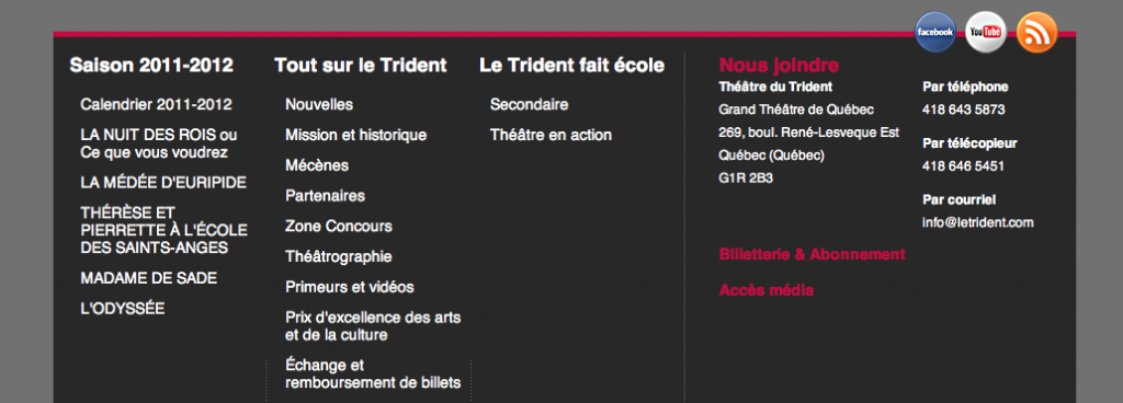
It can also be a footer menu simplified , showing only the first level of the tree structure.

It’s good to know…
Always follow the basic order of the main menu. Also be aware that, visually, a complex menu can make your site appear larger than it really is, which may or may not be interesting depending on the case.
Trend # 2: The blog
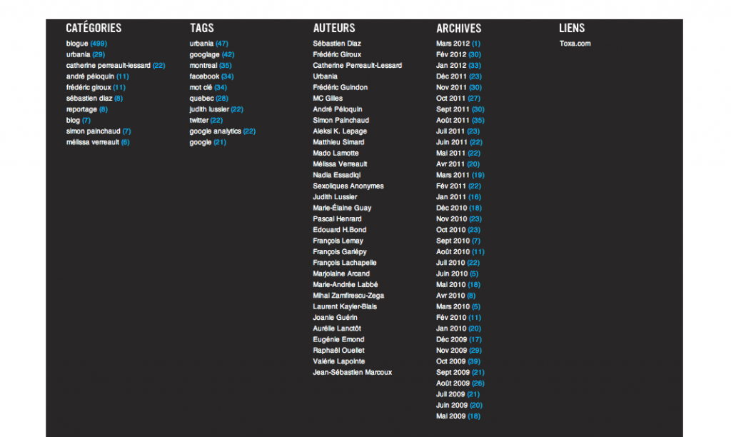
More and more companies are daring to create a blog in order to interact with their customers and be in business differently. For blog design, the footer can become a reminder categories, authors, dates, recent posts … In short, everything that constitutes a blog!
Trend # 3: Advanced functions
What is that? These are forms, email registration, social media, tag cloud, the tags popular, etc.

It’s good to know…
Often off the screen, avoid turning the footer into a single path for an action. For example, if the newsletter subscription is found in the footer (and only there), you risk losing a lot of subscriptions! Same thing for the search box. By convention, it is better to put it at the top of the site.
My tendency: Make it useful!
Knowing that it is preferable to insert content already present in the site, why not make the footer useful, and even better, dynamic? Divide it and assign a specific topic to each section, taking care to recall important information. Or energize it, like Le Grenier in the news which offers a tab system. Don’t be afraid to highlight the most important pages or links.

Okay, and what should he look like?
Remember … We originally wanted the footer to disappear and be tiny on our page. Today, it is assumed, thoughtful and takes up space.
Trend # 1: Color
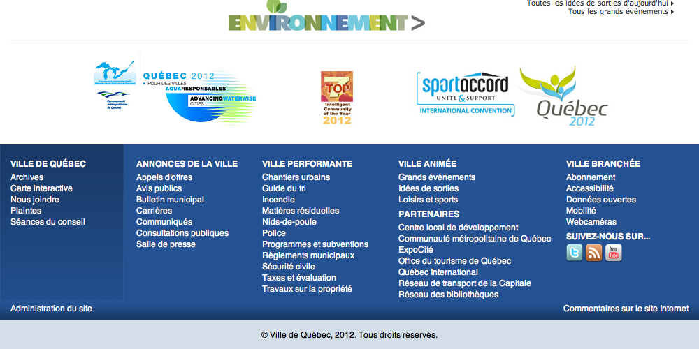
Separating content with a bold color, whether it’s bright or dark, is a great way to give footer impact.

Trend # 2: The illustration
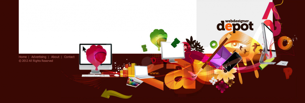
The illustration can be used to attract the eye. It can be completely exploded, or more subtle and metaphorical.
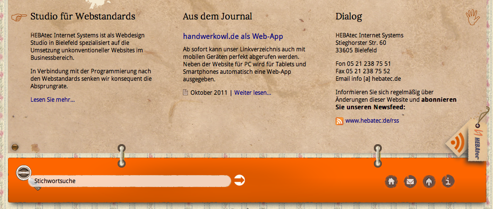
Trend # 3: The ground and the basement
Sub-category of illustration, this influence is increasingly present. Treating the footer like the floor or basement of your site is a really fun way to make your site look attractive.
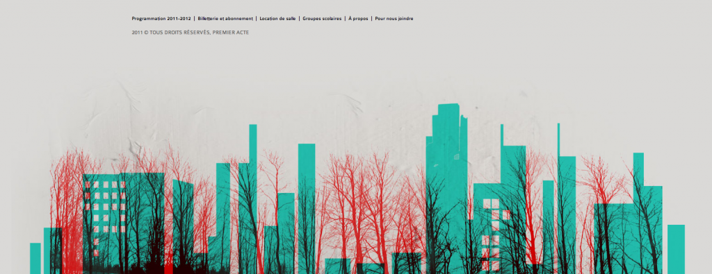


In short, successfully leveraging the footer will increase the usability of your website. Remember that a visitor doesn’t read everything, their eyes scroll and scan the page quickly. Pay special attention to the last place their gaze will be before leaving your site.
Leave a Reply