The design of a website often goes beyond aesthetics. Let us think in particular of sites which present and sell a place, such as the site of a hotel, an inn, a ski center or other. It then becomes imperative that this place is reflected in the visual of the website. We want visitors to know what to expect and have a clear idea when they walk through the door of the establishment, and this is as much in the interest of the owner as in the interest of visitors.
As a web designer, you will therefore have to find a way to represent the establishment graphically with realism. With realism and accuracy, because overdoing it will oversize the expectations of customers who will experience disappointment, however small, in spite of themselves. Conversely, a design that is too simplistic will not do justice to the establishment and will sell the product poorly. In short, we want the site to reflect the image of the establishment, no more, no less.
Where to start?
I present to you a very simple approach, but which works well, and not only in web design (basically, I used this approach for the graphic design of museum exhibitions):
Go to the places
If it’s possible of course. Once there, trust your first impression. Take notes: is the place friendly, classic, elegant? Be curious, pay the owner a visit.
Pay attention to the atmosphere and the people working. Is the service formal or warm? Wearing a uniform or not can sometimes be a good indicator.
play paparazzi
If you have the right, photograph the key places, the most frequented places as well as individual rooms (ok, bathrooms are not required here :)). Also take exterior photos of the building as well as the surroundings.
Keep in mind that the photos do not need to be of good quality and be careful not to disturb the customers on site.
If you don’t have permission to take photos, you can always fall back on our friend Google.
Dissect and analyze
This is the crucial step.
Take a step back and look at the photos you have taken. Identify repetitive elements: are there recurring colors or patterns? What are the materials? Wood, metal, fabric?
And overall, is the place bright or dark? Cluttered or uncluttered? Urban or outdoor style? Antique or modern? Is there a strong presence of verticality with an excessive ceiling height or are there vast spaces that give the illusion of depth and horizontality?
How could you use these elements in your visual?
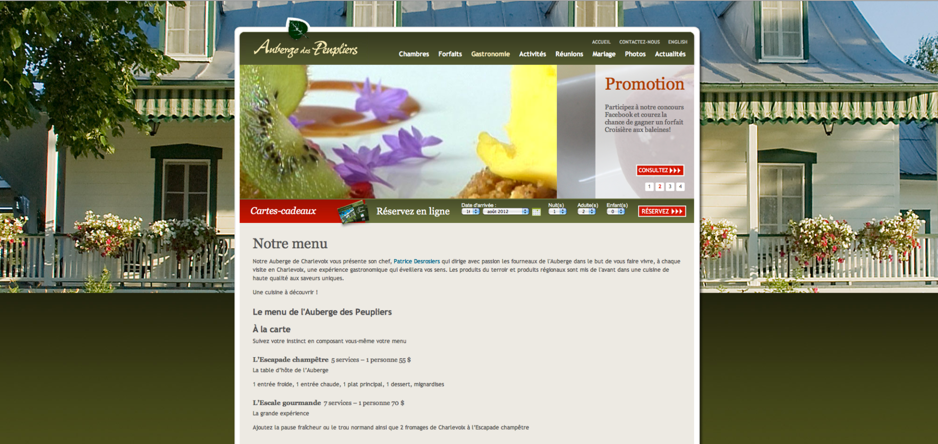
You must then translate these elements into your graphic models. Make simple but explicit choices. For example, the Auberge des Peupliers site in Charlevoix inspires nature and panoramic views through, among other things, an airy design and the use of large masses in shades of green.

Not just the graphics
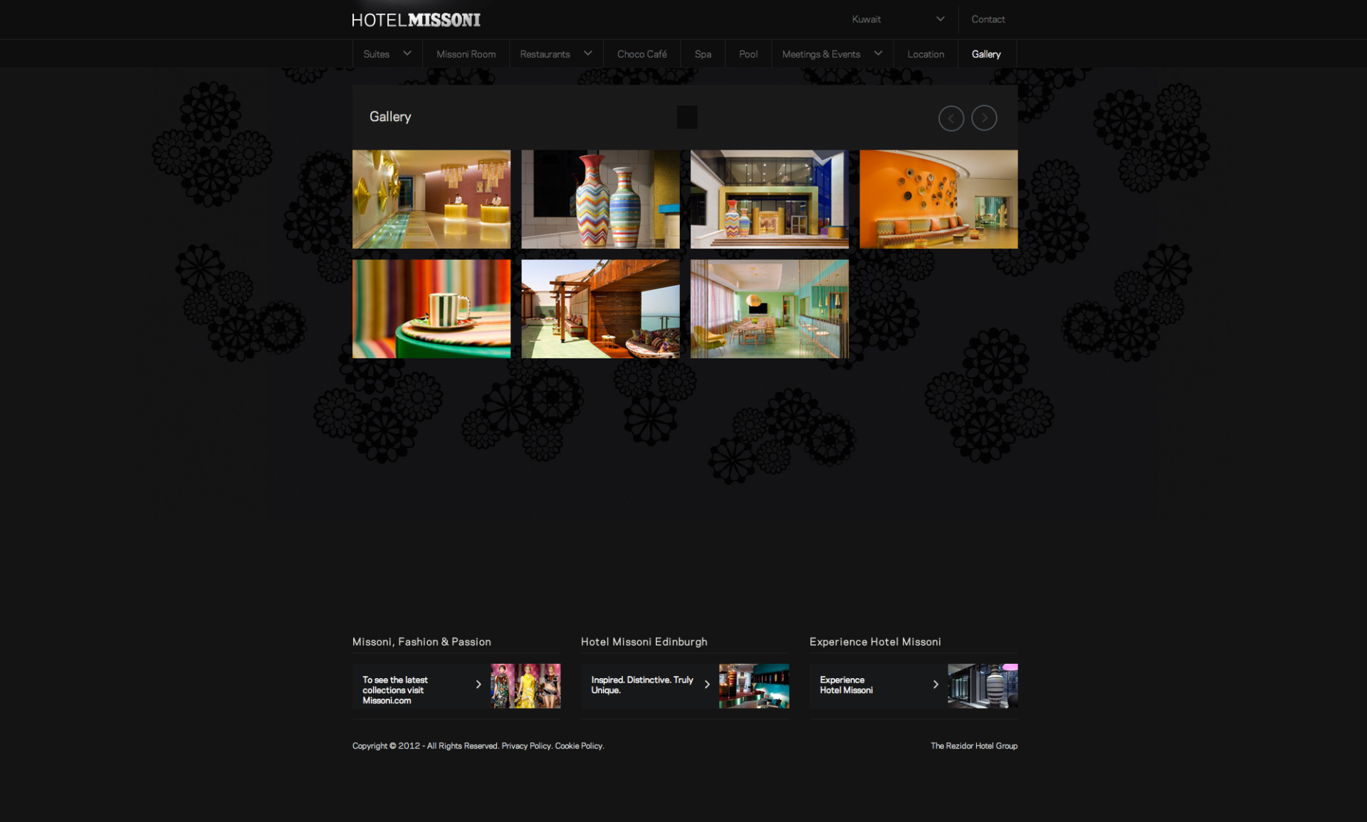
Finally, do not rely on graphics and also include professional photos of the place. Large photos will speak for themselves. They can occupy the entire background, be grouped together in a gallery like on the Hotel Missoni website, or inserted into the content of the pages.

So here is this simple little approach that relies on the judicious combination of architectural elements translated into visual elements in a Web design. Do you have any other tips to share?

Leave a Reply